The Benefits of Responsive Web Design for Modern Websites
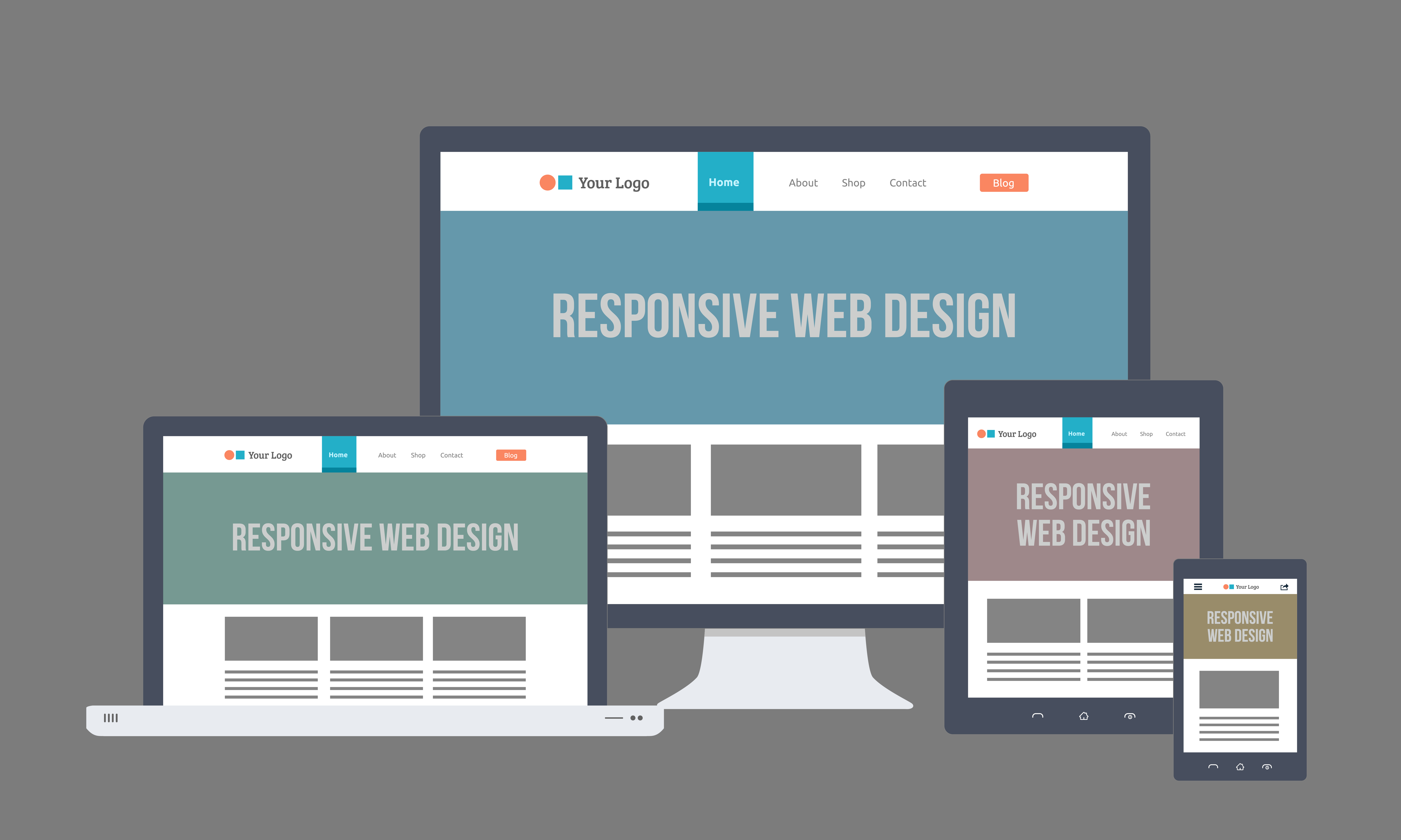
In today's digital landscape, responsive web design has become a fundamental aspect of creating modern websites. This approach ensures that a site is easily accessible and functional across a variety of devices, from desktop computers to smartphones. By utilizing fluid grids and flexible images, responsive design allows websites to adapt to different screen sizes seamlessly, enhancing user experience and engagement. Additionally, search engines like Google prioritize mobile-friendly sites in their rankings, making responsive design not just an aesthetic choice but a crucial element for SEO success.
Another significant benefit of responsive web design is its cost-effectiveness. Instead of developing separate websites for desktop and mobile users, a single responsive site can serve all audiences, reducing development and maintenance costs. This approach simplifies the management of updates and content, as changes can be made in one central location rather than multiple sites. Furthermore, responsive design often results in faster load times, leading to a better user experience and improving overall site performance, which are vital factors in retaining visitors and enhancing conversion rates.
How Responsive Web Design Enhances User Experience Across Devices
Responsive web design is crucial in today's digital landscape, as it allows websites to adapt seamlessly to various screen sizes and devices. By employing flexible grids, layouts, and images, responsive design ensures that content is presented optimally, regardless of whether users are accessing it from a desktop, tablet, or smartphone. This adaptability not only improves the overall appearance of the site but also enhances its functionality, making navigation intuitive and user-friendly.
Moreover, responsive design significantly impacts user experience by providing consistent performance and accessibility. With the increasing use of mobile devices, having a website that adjusts fluidly to different resolutions reduces the frustration of users who might otherwise encounter difficult-to-read text or oversized images. In turn, satisfied visitors are more likely to stay on the site longer, engage with the content, and return in the future, ultimately boosting conversion rates and enhancing brand loyalty.
Is Your Website Mobile-Friendly? Key Features of Responsive Design
In today’s digital landscape, ensuring that your website is mobile-friendly is no longer optional; it's essential. A significant portion of web traffic comes from mobile devices, and if your site isn't optimized for these platforms, you risk losing valuable visitors and potential customers. Key features of responsive design include fluid grids, flexible images, and media queries that allow your website to adapt to different screen sizes and orientations seamlessly. This adaptability not only improves user experience but also plays a crucial role in your site's search engine ranking.
Among the critical elements of responsive design is the use of media queries, which allow your site to change its layout based on the device being used. This can include:
- Breakpoints: Set specific points where your website content rearranges based on the screen size.
- Viewport Meta Tag: Ensures proper scaling and representation of your site on various devices.
- Touchscreen Readiness: Ensures buttons and links are easy to click on smaller screens.
By implementing these features, you not only enhance usability for mobile visitors but also align your website with best practices for SEO.