The Art of Choosing Fonts: How Typography Influences User Experience
The choice of fonts in your design plays a crucial role in shaping the user experience. Typography is not just about aesthetics; it significantly affects readability, accessibility, and even brand perception. For instance, using a sans-serif font can lend a modern and clean feel, while a serif font often conveys tradition and reliability. When selecting the right font, consider factors such as the target audience, the nature of the content, and the emotions you want to evoke. A well-chosen font can enhance the clarity of your message and engage users more effectively.
Moreover, the consistency of typography across your website or blog is vital for creating a seamless experience. Maintaining a cohesive font hierarchy helps guide users through your content, making it easier to navigate. For example, using different font sizes or weights for headings, subheadings, and body text can create a clear structure that draws readers' attention where it matters. Additionally, be mindful of contrast between text and background colors to ensure optimal readability. By mastering the art of font selection and typography, you can significantly elevate your user experience.
Decoding Typography: What Every Designer Should Know About Font Pairing
Typography is a fundamental aspect of design that can significantly influence how your message is perceived. One of the key elements of effective typography is font pairing, which involves selecting two or more fonts that complement each other to create visual harmony. Understanding the principles of font pairing can elevate your designs and ensure that your textual content is both aesthetically pleasing and easy to read. When considering font pairing, keep in mind contrasting styles, such as pairing a modern sans-serif with a classic serif font, to create a dynamic yet cohesive look.
Another important factor in font pairing is the hierarchy of your design. By utilizing different font weights, sizes, and styles, you can guide the viewer's eye through the content effectively. For example, a bold header can be paired with a light italic body text to establish a clear distinction between headings and body content. Experimentation is vital; don't be afraid to try out various combinations to find the perfect match for your project. By mastering font pairing, designers can create impactful layouts that enhance readability and engagement.
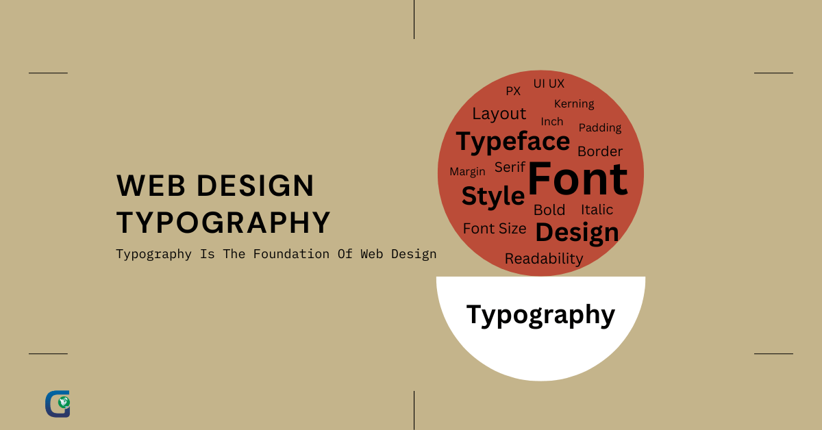
What Makes Typography Effective? Exploring the Principles of Web Text Design
Typography is a crucial element of web design, influencing not only aesthetics but also the readability and user experience of digital content. Effective typography involves several key principles, including font choice, size, and spacing. A well-selected font can communicate the tone and purpose of a website, while appropriate sizes and spacing ensure that text is easy to read across various devices. Consistency in typography reinforces brand identity and helps guide users through the site's content seamlessly.
Another significant aspect of effective typography is the use of hierarchy. This refers to the visual organization of text elements to create a clear path for readers. By employing techniques like different font weights, colors, and sizes, designers can highlight important information and make content scannable. Additionally, incorporating adequate line height and letter spacing contributes to a comfortable reading experience, preventing users from feeling overwhelmed by dense blocks of text.